
Many business decisions revolve around location and mobility data. Location data may be used for predictive analysis in marketing strategies, better retail experience, health and safety alerts or even hyperlocal advertising.
In this post, we will demonstrate how Google Cloud Platform (GCP) services and Looker can be applied to develop geospatial and mobility visualizations. We will demonstrate a small-scale architecture for a streaming GIS pipeline using GCP services and in particular, showcasing BigQuery’s geospatial data storage and analysis capabilities. In our solution we’ve leveraged these features to visualize mobility data in Toronto, Canada related to the COVID-19 pandemic in near-real-time with Looker.
BigQuery is Google Cloud’s data warehouse which can be used to analyze extensive amounts of data in near-real-time. BigQuery GIS allows you analyze geospatial data at incredible speeds.
Looker optimizes the process of analyzing and visualizing the location data. Hand-in-hand with BigQuery, users can see vast amounts of location data on a map in near-real-time.
Data
We obtained the latest version of total number of cases per FSA in Toronto from Open Data Toronto in a .CSV file and uploaded this to a table in BigQuery. We also ingested shapefiles containing Canada’s FSA boundaries from Statistics Canada’s Website. The shapefile format is a geospatial vector data format for geographic information system software. It is developed and regulated by Esri as a mostly open specification for data interoperability among Esri and other GIS software products.
Ingesting Shapefiles into BigQuery
BigQuery offers a Geography Datatype that allows you store collection of points, lines, or polygons and multi-polygons that form a “simple” arrangement on the WGS84 reference ellipsoid. We make use of this Geography datatype and several of BigQuery’s Geography Functions in this demo.
The following pseudocode utilizes Geopandas, and the pandas_gbq libraries to ingest the .shp shapefiles into a table in BigQuery.
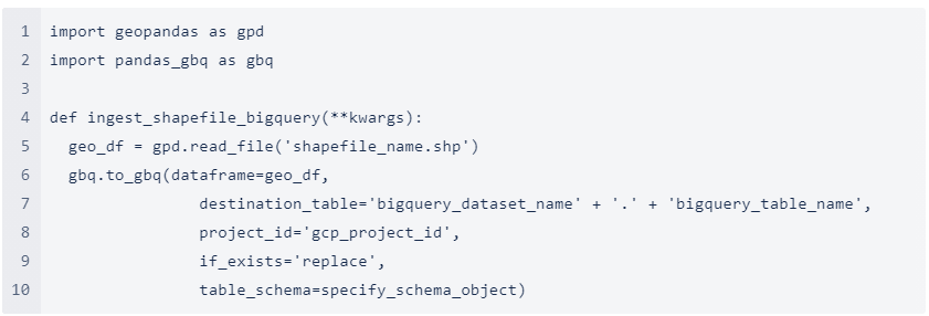
A few notes about the script above:
- Shapefiles when downloaded from StatCan will usually be in a zipped filed format and the gpd.read_file() function can be adjusted accordingly to read zipped files
- The script does not contain code and configurations needed to authenticate with the Google Cloud Platform. This can be done using a Service Account
- After this script is executed, the Polygons for the FSA boundaries (in GeoJSON format) will be loaded into BigQuery as String datatype. For using the BigQuery Geography functions, one would need to add an extra step to convert this String column to a Geography datatype using the ST_GEOGFROMTEXT function like:

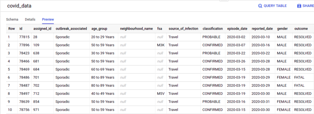
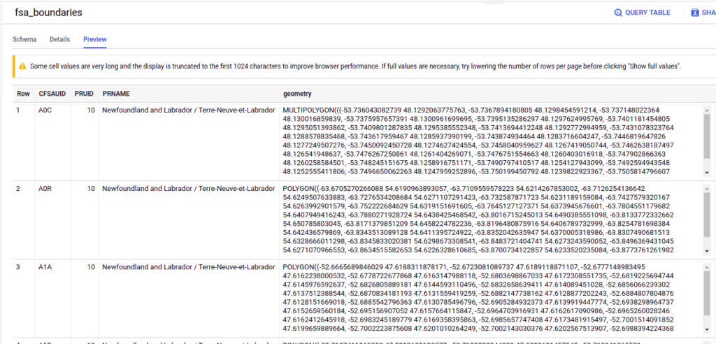
The following are previews of the Toronto Covid data and the FSA data loaded into BigQuery:
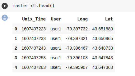
Once the FSA Shapefile and the Census data are loaded into BigQuery, we start simulating user movement data using OSMNX and the NetworkX Python libraries that let you generate paths based on start and end points. The outputs of our script when stored in a Pandas dataframe look similar to:
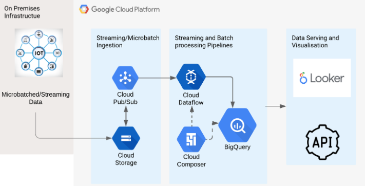
GCP Mobility data processing Streaming Architecture
For the solution demonstrated in this blog, we use a simple server-less streaming architecture on GCP using Pub/Sub, Cloud Functions and Google BigQuery.
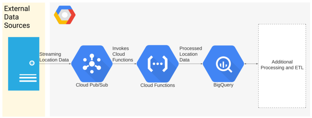
The data simulation script above drops messages into Pub/Sub in the following format:

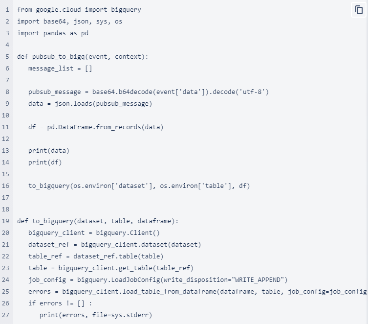
We deploy a Cloud Function that is triggered whenever a new message is published in the Pub/Sub topic created above:

This Cloud Function then parses the message published on the Pub/Sub topic and loads it into BigQuery. A snippet of the main function is listed below:
The updated mobility data table is as follows:

Mobility Data Visualization and Processing using Looker + BigQuery
We then use Looker connected to our BigQuery data set to visualize this mobility data. The final dashboard contains 4 widgets (or “Looks” as referred to in Looker).
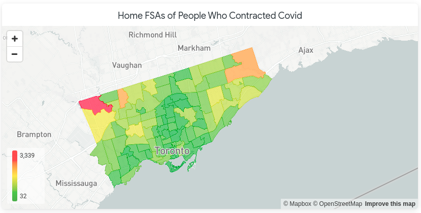
Initial Case Counts
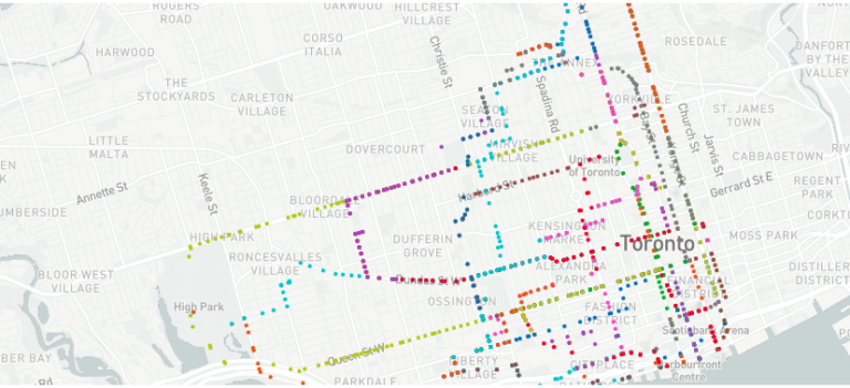
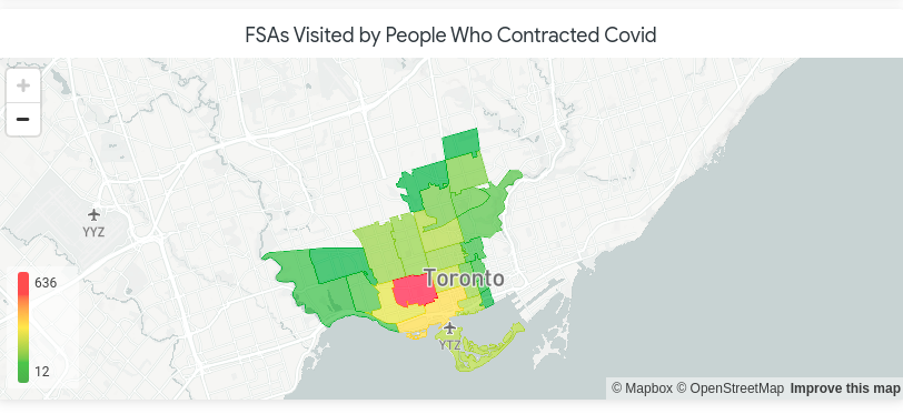
The Looker map below shows the home locations of 30 patients diagnosed with COVD-19. Here, FSAs coloured red have more people diagnosed with COVID-19 and those coloured green have few to none.
Tracking the Outbreak
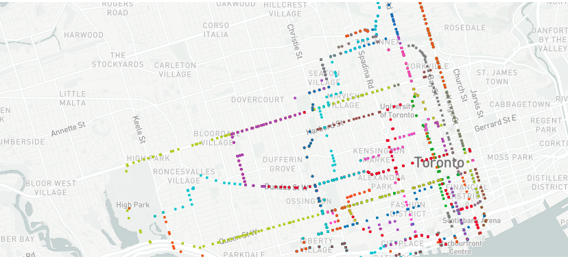
Using the simulated user mobility/movement data, we created another map that shows the journeys of these users across the FSAs over time:
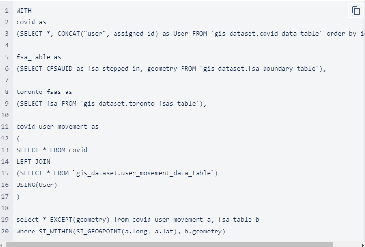
As affected people move, they also change the total number of case counts in a given FSA at any given time. We track this change in number by using BigQuery’s ST_WITHIN() Geography function that checks whether a given latitude-longitude pair lies within a FSA boundary. The backend view for generating which FSA an user has stepped in at a given timestamp can be created using the query below. Note that this query may need modifications based on your dataset, table names and use case.
Using the appropriate Looker Explore feeding off of the BQ View created above, we can create another map that updates with the modified case counts per FSA as users move. The map shown below shows a change in the number of covid cases in each FSA based on the user movement from the first map shown in this blog.
We the also simulate the movement of 3 “healthy” people across the various FSAs as Covid-affected users move as well. On this map, the paths of these users can be seen, with the paths changing colours from green to red as the risk level increases for the people.

We used an arbitrary formula to calculate the risk score that is directly proportional to the number of cases in the FSA only for the purposes of demonstration
Near-Real-Time Visualization
Using Looker’s ability to refresh dashboards at fast rates (in this case, < 3 seconds) and BigQuery’s high-speed processing, we were able to stream in the data to the Looker dashboard.
The live dashboard with the user movement data streaming in can be seen in the video below:
This was a successful use case in determining how the walking patterns of users could propagate the disease in various parts of Toronto. We can see new areas highlighted red that could otherwise be missed if the mobility data was not accounted for.
A Scalable Micro-Batching Approach
The architecture used for the demo in this blog suffices when the data being sent in one message to the Pub/Sub topic is not large. As the amount of mobility data dropped at a given time keeps increasing (which is more realistic, given population numbers), the architecture shown above needs to be scaled sufficiently.
Specifically, the multiple data points can be dropped in a single batch into a GCS bucket using CSV files. Each file drop triggers a Pub/Sub message that contains the file name in it’s body. This is received by a Dataflow job that reads the data file, processes the points in the file and loads the mobility data into BigQuery.
Google Cloud Composer can be used to schedule the Dataflow job deployments as well as any further Geospatial Analytics tasks in BigQuery.
The architecture illustrating the approach described above is show below:
A Powerful Stack for Geospatial data analysis on the Cloud
As shown in the blog content above, we see that GCP provides a powerful stack for Geospatial data analysis and especially, a robust streaming architecture.